Hover effects are a popular feature in modern web design, adding an interactive and dynamic touch when users place cursor over images or buttons. Among these effects, the wave hover effect stands out for its subtle and engaging animation, mimicking waves’ gentle rise and fall. This tutorial will walk you through the process of creating a wave hover effect in Elementor galleries step by step.

Getting Started
Before diving into the implementation, ensure you have the following prerequisites:
- Elementor Plugin: Ensure the Elementor plugin is installed and active on your WordPress site. Elementor Pro is recommended but not mandatory for advanced styling options for this tutorial.
- Custom CSS Capability: The wave hover effect requires custom CSS. Ensure your theme or Elementor version supports custom CSS. If you’re using Elementor Pro, you can directly add CSS to individual elements.
Steps to Create a Wave Hover Effect
Step 1: Add the Elementor Gallery Widget
- Open your WordPress dashboard, navigate to Pages > Add New Page, or edit an existing page.

2. Switch to the Elementor editor, and drag the Gallery Widget from the left-hand panel onto your page.
3. Upload the images you want to display in your gallery.

4. Configure the layout of the gallery to suit your design preferences.

Step 2: Add a Custom Class to the Gallery Images
You’ll need to assign a custom class name to apply the wave hover effect to specific images.
- Select the gallery widget and go to the Advanced tab in Elementor.

2. Locate the CSS Classes field and enter a custom class name like wave-hover.

This step ensures the CSS code you add later will only target these images.
Step 3: Add Custom CSS for the Wave Hover Effect
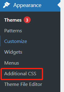
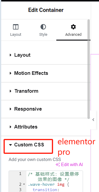
It’s time to bring the wave hover effect to life with CSS. You can add the CSS code to the gallery’s Custom CSS section (Elementor Pro) or add it to your theme’s additional CSS area.


Here’s the CSS code:
/* Basic Styles: Prepare Images for Hover Effect */
.wave-hover img {
  display: block; /* Ensures proper animation behavior */
  transition: transform 0.4s ease-in-out; /* Smooth transition for hover effect */
  will-change: transform; /* Optimizes browser performance */
}

/* Wave Hover Effect */
.wave-hover img:hover {
  transform: translateY(-10px) rotate(2deg) scale(1.05);
  animation: wave 0.6s ease-in-out infinite; /* Applies the wave animation */
}

/* Wave Animation Definition */
@keyframes wave {
  0%, 100% {
    transform: translateY(-10px) rotate(2deg); /* Smooth loop starting and ending points */
  }
  25% {
    transform: translateY(-15px) rotate(-2deg); /* Higher wave with a slight reverse rotation */
  }
  50% {
    transform: translateY(0px) rotate(2deg); /* Returns to initial position */
  }
  75% {
    transform: translateY(-5px) rotate(-1deg); /* Slight dip with reverse rotation */
  }
}
Code Explanation:
.wave-hover img: Defines the default styles for the gallery images, enabling smooth transitions..wave-hover img:hover: Specifies the wave effect when the cursor hovers over the image.@keyframes wave: Creates the animation for the wave effect, alternating the image’s position and rotation to mimic a wave-like motion.
Step 4: Save and Preview the Page
Once the CSS is in place, save your changes and preview the page. When you hover over the images in your gallery, they should display a wave-like motion, creating a visually engaging experience for your users.
Optional Customizations
To tailor the effect to your design needs, you can adjust the following parameters:
- Wave Intensity: Modify the
translateY()values in the CSS to increase or decrease the wave height. For example:- Larger values (
translateY(-20px)) create a more dramatic effect. - Smaller values (
translateY(-5px)) result in a subtler wave.
- Larger values (
- Animation Speed: Adjust the animation duration (
0.6s) to make the wave faster or slower. - Rotation Angle: Change the
rotate()values to adjust the degree of image tilt.

Enhancing the Wave Hover Effect with Shadows
For added depth, you can enhance the effect with shadows. Update the CSS as follows:
.wave-hover img:hover {
  transform: translateY(-10px) rotate(2deg) scale(1.05);
  animation: wave 0.6s ease-in-out infinite;
  box-shadow: 0px 10px 15px rgba(0, 0, 0, 0.2); /* Adds shadow for depth */
}
The shadow effect makes the wave animation more dynamic, giving the impression that the images are lifting off the page.
Final Touches
To ensure the effect runs smoothly across devices and browsers:
- Test the page on both desktop and mobile.
- Use browser developer tools to verify that the CSS is applied correctly.
- Optimize the images in the gallery for faster loading times.
Summary
Hover effects are a fantastic way to add interactivity and visual interest to your website. The wave hover effect, with its smooth, water-like motion, is an excellent choice for creating a modern and dynamic design.
In this tutorial, we covered:
- Adding a gallery in Elementor.
- Assigning a custom class to the gallery images.
- Implementing CSS to create the wave hover effect.
- Customizing the animation for unique designs.
With just a few simple steps, you can create a stunning wave hover effect that will captivate your users and enhance your website’s overall aesthetic. Try it out and elevate your Elementor galleries today!